Greystar, a global property leader, came to us with a goal of entering and leading the Australian Build-to-Rent (BTR) market. They needed a standout brand system that could differentiate them from competitors and allow them to scale quickly to become the preferred choice for Australian renters.
Through research carried out by Kantar, we learned that the BTR sector is set to quadruple within four years. Therefore, it’s crucial for Greystar to establish early market leadership if they’re to build strong brand equity and capture consumer interest ahead of competitors.
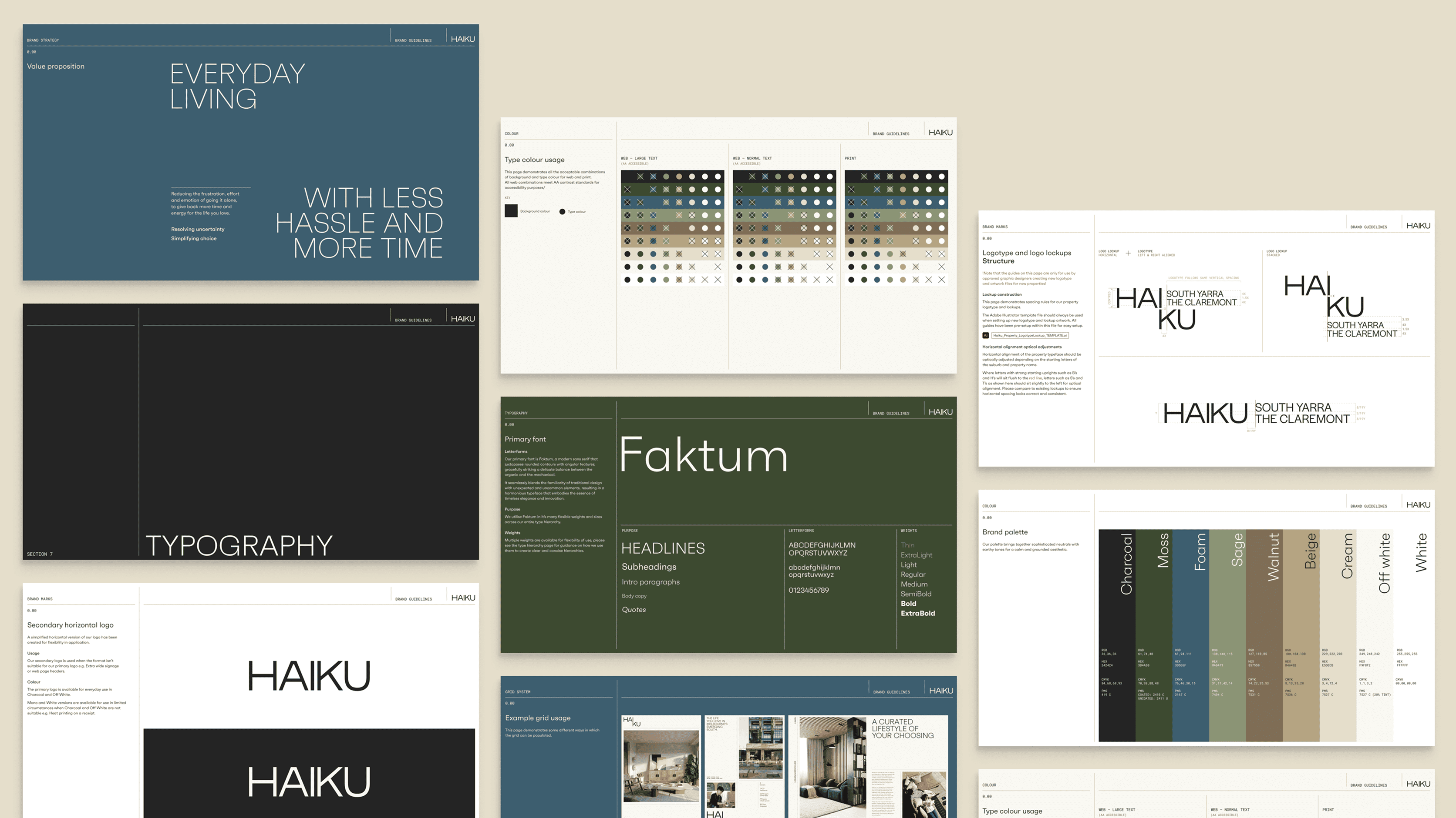
Collaborating with Kantar we developed a strategic foundation, which informed the creation of the master brand as it is now known; Haiku. The name is inspired by the iconic poetry style that tells stories reflecting a moment and mood in time.
Haiku is designed to strip away life's burdens, leaving only the elements residents love. This approach to placemaking is at the heart of the brand's identity.
Defining clear brand architecture set us up for workshops with the client to define the Haiku brand expression. Together, we established a clear verbal identity, from brand essence, to character, tone of voice, and principles.
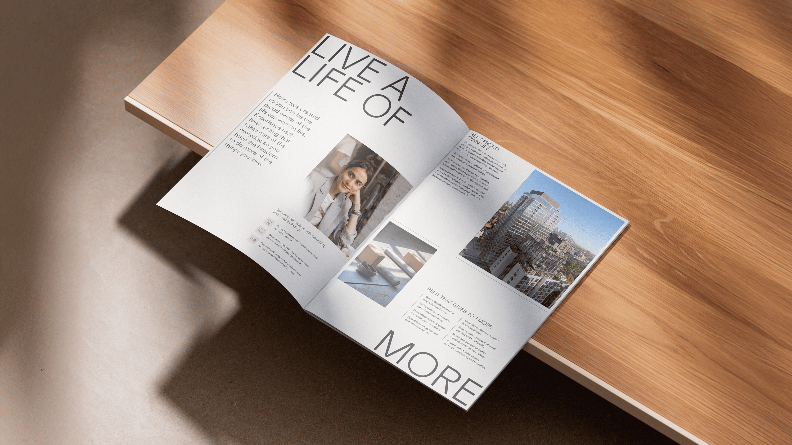
The visual concept, "Firm Foundations," was based on the essence of "Illuminating Possibilities," representing both their core offering of service-led renting and the product; premium apartments. The flexible grid symbolises structure and stability, while elegantly curated imagery and type treatments depict a lifestyle-first approach.
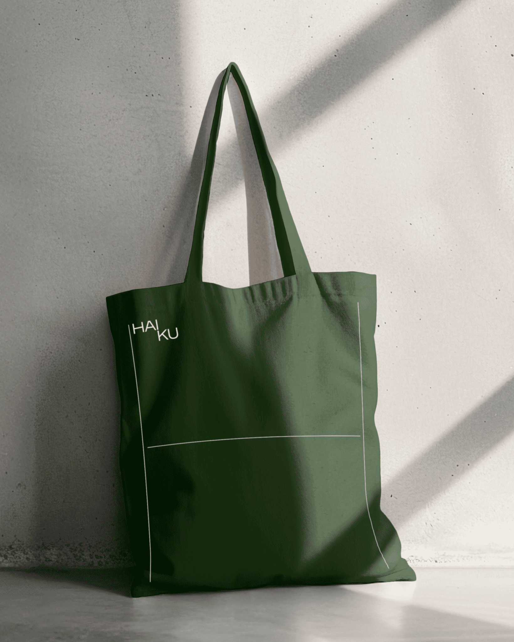
Our visual identity includes a stacked logo inspired by the syllabic structure of haikus and an earthy colour palette designed to resonate with diverse audiences without dating. The core typefaces, a blend of organic and mechanical styles, represent the residents and the product, respectively. Roboto was chosen for its blueprint and floor plan influence.
Once the brand identity was established, we partnered with Rocket, Greystar's digital agency, to design the Haiku website. We focused on user experience, ensuring the site showcased Haiku's premium properties and built strong brand equity across Australia.
Since commencing our work with Greystar in Feb 2024, we’ve built a brilliant ongoing working relationship with each new property that’s built. The Haiku brand sets the foundations for the longevity and growth of the Haiku offering.